What Makes a Landing Page High Converting?


A landing page can receive hundreds or thousands of visitors and still generate disappointing results. The difference between a page that simply attracts traffic and a high converting landing page often comes down to how effectively it guides visitors towards one clear action.
Whether the goal is to generate leads, book consultations, sell a product, encourage registrations or get visitors to request a demo, every element of the page should support that objective.
A successful landing page does not try to communicate everything about a business. Instead, it gives visitors the right information at the right moment, answers their most important questions, reduces uncertainty and makes the next step easy.
This is where landing page design and Conversion Rate Optimisation (CRO) work together. A visually appealing page may attract attention, but its messaging, offer, usability, trust signals and conversion path determine whether visitors actually take action.
So, what makes a landing page high converting? It starts with a clear purpose and continues with a combination of strong value propositions, focused CTAs, persuasive content, relevant visuals, social proof, simple forms, mobile usability and continuous testing.
What Makes a Landing Page High Converting?
A high converting landing page is built around one primary conversion goal.
That goal could be “Book a Demo,” “Get a Quote,” “Start Free Trial,” “Download the Guide” or “Buy Now.” The exact action depends on the business and where the visitor is in the buying journey.
The page should make that action obvious without overwhelming the visitor with competing options. Unnecessary navigation, unrelated offers and multiple competing CTAs can introduce distractions.
The first few seconds are particularly important. Visitors should be able to understand what the page offers, who it is intended for and what they should do next. Current landing-page guidance similarly emphasizes a clear objective, compelling CTA and focused design.
Think of the basic journey as:
Attention → Problem → Solution → Benefits → Trust → Offer → CTA
When these elements work together, the visitor can move naturally from understanding the offer to considering it and finally taking action.
Start With a Strong Value Proposition
Your value proposition is one of the most important components of a landing page.
Visitors should not have to spend time figuring out what you offer or why it matters. The headline and supporting copy should communicate the central benefit quickly.
For example:
Headline: Manage Your Projects in One Place
Subheadline: Plan, collaborate and deliver projects faster with an intuitive workspace built for modern teams.
The headline communicates the core outcome, while the supporting statement adds context.
A strong value proposition should answer three basic questions:
What are you offering?
Who is it for?
Why should the visitor care?
Avoid vague marketing language that sounds impressive but does not explain the actual benefit. Specificity makes it easier for visitors to understand whether the offer is relevant to them.

Create a Compelling Hero Section
The hero section is usually the first major section visitors encounter. It should immediately establish what the page is about and what action the visitor can take.
A well-designed hero section commonly includes a clear headline, supporting copy, primary CTA and a relevant visual.
The visual should reinforce the message rather than simply occupy space. For example, a software company could show its product interface, while a professional service business might use an image demonstrating the service or outcome.
The hero section should also work well on mobile. A headline that looks concise on desktop can become several lines on a smartphone, while an oversized image can push the CTA too far down the screen.
A useful test is simple: if someone sees the page for a few seconds, can they understand its purpose?
Use One Clear Primary CTA
A high converting landing page should make the next step obvious.
Instead of giving visitors several competing choices, establish one primary action. Depending on the offer, this could be “Book a Demo,” “Get a Free Consultation,” “Start Your Free Trial” or “Request a Quote.”
CTA wording should also describe the action or benefit clearly. Generic labels such as “Submit” provide little information about what happens next.
The CTA should be visible where visitors need it and repeated strategically on longer pages when appropriate.
This does not mean every landing page must literally contain only one button. The important principle is that the page should have one dominant conversion objective rather than forcing visitors to choose between unrelated actions.
Build Trust With Social Proof
Even when visitors understand an offer, they may hesitate because they are unsure whether they can trust the business.
Social proof can help address this hesitation.
Testimonials, customer reviews, case studies, client logos, ratings, certifications and relevant performance statistics can demonstrate that other people have already chosen the business.
However, authenticity matters. A generic testimonial such as “Great service!” provides little useful information. A specific testimonial explaining the customer's problem, experience and outcome can be considerably more persuasive.
Social proof can be particularly useful near important decision points, such as forms, pricing information or CTAs. Current CRO guidance also recommends using relevant, authentic testimonials and placing trust signals where they can address visitor hesitation.

Focus on Benefits, Not Just Features
A common landing-page mistake is describing what a product or service does without explaining why it matters.
Features describe capabilities. Benefits explain the value created by those capabilities.
For example:
Feature: Automated reporting
Benefit: Save hours every week with reports generated automatically.
The feature tells visitors what the product includes. The benefit tells them how their situation could improve.
When writing landing-page copy, connect important features to practical outcomes. Consider what the customer is trying to achieve, what problem they want to solve and what frustration they want to avoid.
This makes the page more relevant to user intent.
Make the Landing Page Easy to Scan
Visitors rarely read every word on a landing page from beginning to end. They scan headings, highlighted information, images, CTAs and short sections to determine whether the page is relevant.
That means content presentation matters.
Use descriptive headings, concise paragraphs, adequate whitespace and a logical visual hierarchy. Important information should be easy to locate without requiring visitors to search through large blocks of text.
At the same time, avoid removing so much information that visitors cannot make an informed decision.
The right amount of content depends on the complexity of the offer and the visitor's level of awareness. A simple free trial may need less explanation than an expensive B2B service.
Optimise Forms for More Conversions
Forms are often the final step between interest and conversion, which makes them an important part of CRO.
A form should ask for information that is genuinely necessary.
If a visitor wants to request a consultation, asking for their name, email and perhaps company information may be reasonable. Asking for numerous details that are not required at that stage can introduce unnecessary friction.
Shorter forms are not automatically better in every situation. Some businesses need additional information to qualify leads. The objective is to find the right balance between lead quality and ease of completion.
Clear labels, simple layouts and an explanation of what happens after submission can also improve the experience. Landing-page best-practice guidance consistently emphasizes reducing unnecessary form friction.

Use Visuals That Support the Message
Images and videos should have a purpose.
A product screenshot can show how software works. A demonstration video can explain a service. A diagram can simplify a complicated process. A relevant photograph can help visitors visualize the experience or outcome.
Avoid using visuals simply because the page looks empty without them.
Every image should contribute to understanding, trust or persuasion.
Visual quality also matters. Blurry images, irrelevant stock photography and overly decorative graphics can reduce perceived credibility.
A high converting landing page uses visuals as part of its communication strategy rather than as decoration.
Make Mobile Conversion a Priority
A landing page that works beautifully on desktop can still lose conversions on mobile.
Visitors should be able to read the headline, understand the offer, tap the CTA and complete the form comfortably on a smaller screen.
Pay attention to font sizes, button dimensions, spacing, form fields, image scaling and page length. Avoid layouts that require excessive zooming or horizontal scrolling.
Mobile experience is also part of broader page experience considerations. Google recommends paying attention to mobile usability, Core Web Vitals, secure browsing and avoiding intrusive experiences.
A Landing Page Expert should therefore evaluate both desktop and mobile experiences rather than treating mobile as an afterthought.
Reduce Friction and Distractions
Every unnecessary element can compete with the primary conversion goal.
A landing page may lose effectiveness when it contains extensive navigation, unrelated links, excessive pop-ups, multiple competing offers or information that does not help visitors make their decision.
This does not mean a page should be empty. It means every important element should have a reason to exist.
Ask yourself:
Does this section explain the offer?
Does it address an objection?
Does it build trust?
Does it communicate a benefit?
Does it help the visitor take the next step?
If an element does none of these things, consider whether it belongs on the page.
Focused landing pages are generally designed to minimize distractions and keep attention on the intended conversion.
Create Urgency Without Being Pushy
Urgency can encourage visitors to make a decision instead of postponing it.
Limited-time pricing, registration deadlines, limited availability or genuine bonuses can provide a legitimate reason to act now.
The important word is genuine.
Artificial countdown timers, misleading scarcity claims or pressure tactics can damage trust. Urgency should help visitors understand why taking action now makes sense rather than manipulate them into making a decision.
The offer should remain valuable even without aggressive pressure.
A/B Test What Actually Works
Even experienced marketers and designers cannot predict exactly how every audience will respond.
This is why testing is an important part of CRO.
You can test different headlines, CTA wording, forms, layouts, images, offers and social-proof placements. A/B testing allows traffic to be divided between different versions so their performance can be compared.
For example, you might test:
Version A: “Book a Free Consultation”
Version B: “Get My Free Growth Consultation”
The goal is not to change elements randomly. Each test should have a hypothesis explaining what you expect to improve and why.
A/B testing guidance recommends defining the hypothesis and measuring results rather than making decisions purely on assumptions.
A test that does not produce an improvement can still provide useful information. CRO is a continuous learning process, not a search for one magical design.
Build a Strong Landing Page Structure
A useful structure for many landing pages is:
Attention → Problem → Solution → Benefits → Social Proof → Offer → CTA
The hero section captures attention and communicates the value proposition.
The problem section demonstrates that you understand the visitor's situation.
The solution explains how your product or service addresses that problem.
Benefits demonstrate the potential outcome.
Social proof builds credibility.
The offer makes the value clear.
Finally, the CTA gives visitors an obvious next step.
Not every landing page needs every section in exactly this order. The structure should reflect the audience, offer, traffic source and buying journey.
This is where the role of a Funnel Expert becomes valuable. A landing page should fit into the broader funnel rather than operate independently.
Align the Landing Page With the Marketing Funnel
A visitor coming from a Google search may have a different level of intent from someone clicking a social media advertisement.
Likewise, someone who has already interacted with your brand may need less introductory information than a first-time visitor.
The message on the landing page should therefore match the message that brought the visitor there.
For example, if an advertisement promotes a free consultation, the landing page should immediately reinforce that same offer. If the ad promises a specific service, visitors should not arrive on a generic homepage and have to search for it.
Message consistency helps reassure visitors that they have reached the right place. Landing-page best practices specifically recommend aligning landing-page messaging with the campaign or advertisement that generated the click.
A Funnel Expert considers this entire journey, including traffic source, messaging, landing page, offer, lead capture and follow-up.
Measure More Than Conversion Rate
Conversion rate is an important metric, but it does not tell the entire story.
Look at CTA clicks, form abandonment, traffic sources, device performance, engagement, scroll behaviour and cost per conversion.
For example, a page may have a reasonable conversion rate overall but perform poorly on mobile. Another may receive many CTA clicks but lose visitors during the form stage.
These patterns can reveal where the conversion journey is breaking down.
The objective is not simply to increase a percentage. The objective is to understand visitor behaviour and improve the quality and efficiency of the entire conversion process.
How a High Converting Landing Page Designer Approaches the Page
A High Converting Landing Page Designer does more than create an attractive layout.
The design should support communication, usability and conversion. That means considering hierarchy, visitor psychology, CTA visibility, content structure, trust and the relationship between different page elements.
Design decisions should also be informed by the traffic source and audience.
A Landing Page Expert may combine design principles with analytics and CRO research to identify areas where visitors are experiencing friction.
The best result is not necessarily the most visually impressive page. It is a page that makes the value easy to understand and the desired action easy to complete.
Final Thoughts
A high converting landing page is focused, relevant and easy to act on.
It communicates a clear value proposition, presents a compelling offer, uses strong CTAs, establishes trust and removes unnecessary friction. It also works smoothly across devices and uses relevant visuals to support the message.
But there is no universal landing-page formula that guarantees the same results for every business.
The strongest approach combines good design with Conversion Rate Optimisation. Instead of assuming that a particular headline, form or CTA will work, businesses can analyse user behaviour and test meaningful alternatives.
Whether you are building a new campaign page or improving an existing one, the goal remains the same: make it easier for the right visitor to understand the offer, trust the business and take the next step.
That is what turns a landing page from a simple web page into an effective conversion asset.
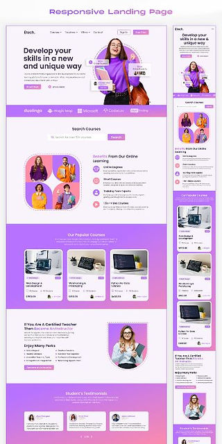
Landing Page Designs




FAQs About Landing Pages
What is a high converting landing page?
A high converting landing page is designed to persuade a significant proportion of relevant visitors to complete a specific action, such as submitting a form, booking a demo, purchasing a product or signing up for a service. It combines clear messaging, a strong offer, focused design, trust and an easy conversion process.
What is the most important element of a landing page?
There is no single element that guarantees conversions. However, a clear value proposition and primary CTA are fundamental because visitors need to understand what is being offered and what they should do next.
How many CTAs should a landing page have?
A landing page should generally have one primary conversion goal. The CTA can appear more than once, particularly on a long page, but secondary actions should not compete with the main objective.
What makes a landing page different from a homepage?
A homepage usually introduces a business and provides multiple navigation paths. A landing page is typically created around a specific campaign, audience, offer or conversion goal and therefore has a more focused structure.
How can CRO improve a landing page?
CRO uses data, user behaviour and experimentation to identify potential barriers to conversion. Businesses can then test improvements to elements such as headlines, CTAs, forms, offers, layouts and trust signals to determine what works better for their audience.
Should landing pages have navigation?
It depends on the purpose of the page, but unnecessary navigation can distract visitors from the primary conversion goal. Many campaign-specific landing pages minimize navigation to keep attention focused on the offer.
How long should a landing page be?
There is no ideal universal length. A simple offer may require relatively little information, while a complex or high-value purchase may require more explanation, proof and objection handling. The page should contain enough information to help the intended visitor make a confident decision without unnecessary content.
Why is mobile optimisation important for landing pages?
Visitors increasingly access websites through mobile devices, so a landing page must be easy to read and interact with on smaller screens. Mobile-friendly layouts, accessible CTAs, usable forms and appropriate spacing can make the conversion process easier.
Should I use A/B testing on my landing page?
A/B testing can be valuable when a page receives enough traffic and conversions to produce useful comparisons. Test meaningful elements such as headlines, CTAs, forms, offers or visuals and use defined hypotheses rather than making random changes.
Can a Landing Page Expert help improve conversions?
A Landing Page Expert can evaluate the page's messaging, structure, design, user experience and conversion journey to identify potential areas for improvement. When combined with analytics and CRO testing, this approach can help businesses make more informed landing-page decisions.

Comments